Pop Up Widget Configuration
Overview of the Pop UP Widget Configuration

Pop Up Widget Overview
Purpose
The donor pop up widget is useful for interactive solutions, as well as with complex non-interactive Canvases where multiple pages that are used across the Canvas come together as different components.
Field and Button Descriptions
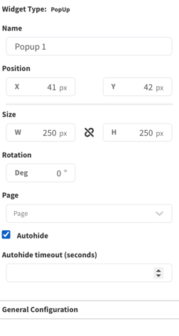
Name

A description of the widget. This is optional, but highly recommended as it will keep your Canvas cleaner and easier to navigate in the future as well as during build.
Position
![]()
The Position section is to identify where the top left of the widget will be positioned within the Canvas.
- X = Horizontal or Left/Right axis
- Y = Vertical or Up/Down axis
0x0 indicates a starting point of the top left of the selected widget at the top left of the Canvas.
Size

- W = Width of the widget (left/right)
- H = Height of the widget (up/down)
Negative Values
Negative values can be applied if you need to strategically allow a widget to go off-screen, but be aware that content outside of the Canvas boundaries don't appear on the display.
To apply negative values, write the number positively and then add the minus symbol afterwards
Rotation

Rotate the widget if desired. The number is the amount in degrees that you can rotate the widget.
Margin
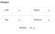
Sets the amount of padding between certain edges of the Donor List widget.
Left/Right/Top/Bottom
Sets how many pixels the text or images needs to stay away from the left or right ends of the widget boundaries.
Middle
Sets how many pixels the text or images needs to stay away from between the columns.
Note that setting padding for between the rows is dictated by the widget height and number of rows selected. More widget height and less rows means greater padding.
General Configuration
Page
The Canvas Page that you want to display in the Pop Up widget.
Autohide
Select if you want the pop up to automatically hide after a set period of time.
Autohide Timeout (seconds)
How long you want the system to wait until it automatically times out and hides the Pop Up widget.
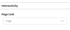
Interactivity

